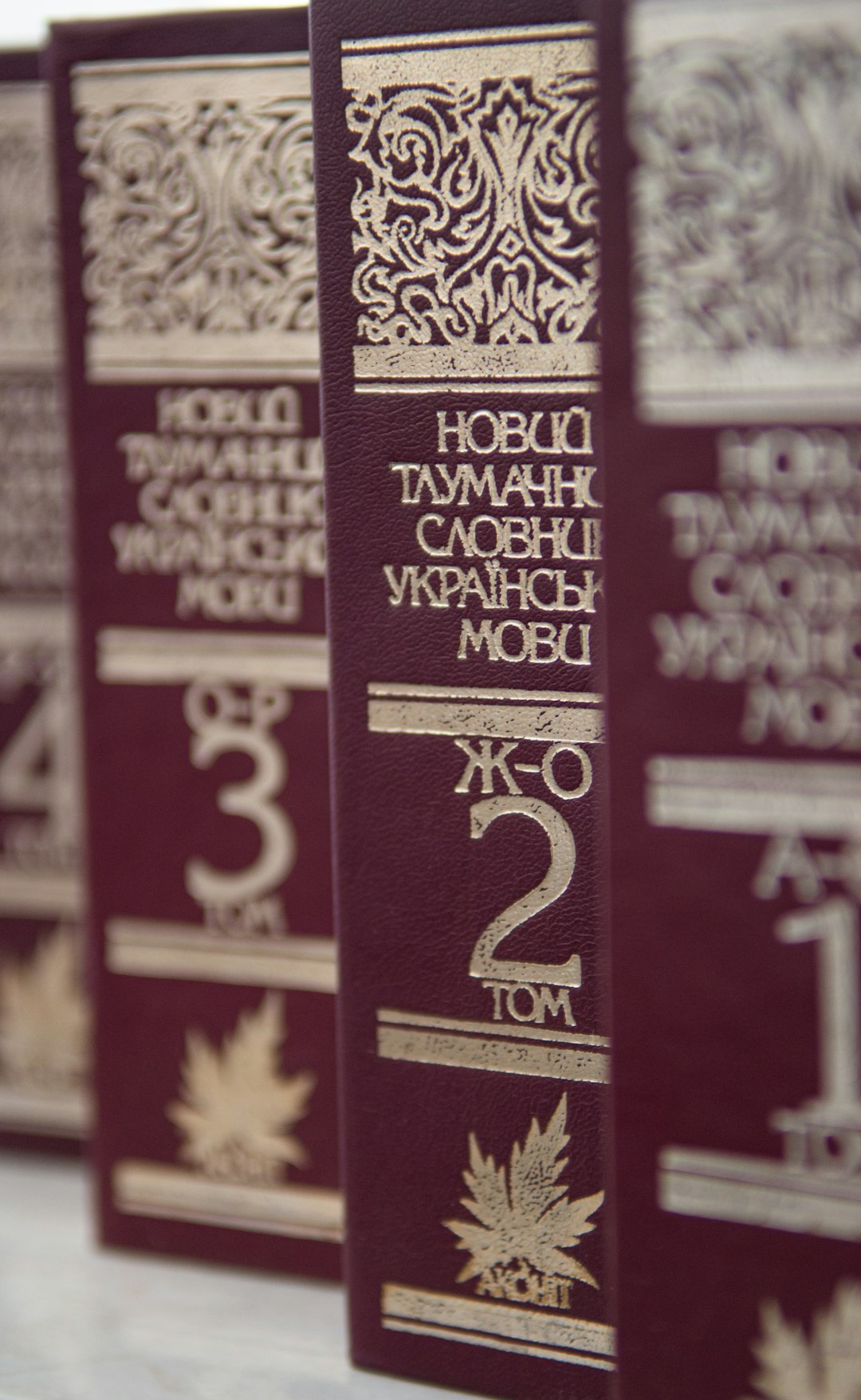
Typography is far more than just the selection of attractive fonts. It's a fundamental design element that creates structure, guides the reader's eye, establishes rhythm, and communicates brand personality. In today's digital landscape, where users are overwhelmed with information, effective typographic hierarchy has become essential for creating engaging, readable, and memorable designs.
In this article, we'll explore how contemporary typographic trends are shaping visual hierarchy in digital and print design, and how you can implement these techniques to enhance user engagement and readability.
Understanding Visual Hierarchy in Typography
Visual hierarchy refers to the arrangement and presentation of elements in a way that indicates their order of importance. In typography, hierarchy guides users through content, helping them understand what to read first, second, and so on. It's the invisible structure that makes content digestible and navigable.
The fundamental principles of typographic hierarchy include:
- Size contrast: Larger elements naturally draw attention first
- Weight variation: Bolder text stands out against lighter text
- Style differentiation: Mixing styles (like serif and sans-serif) to create distinction
- Color contrast: Using color strategically to highlight important elements
- Spacing manipulation: Using white space to create emphasis and separation
When these principles are applied effectively, they create a clear path for the eye to follow, making content more accessible and engaging.
Current Typography Trends Shaping Hierarchy
1. Variable Fonts for Dynamic Hierarchies
One of the most exciting developments in typography is the rise of variable fonts. Unlike traditional font families with fixed weights and widths, variable fonts exist on a spectrum of attributes that can be precisely adjusted.
This technology allows designers to:
- Create more nuanced hierarchies with subtle weight variations
- Improve performance by loading a single font file instead of multiple weights
- Implement responsive typography that adapts to different screen sizes
- Design interactive typography experiences that respond to user actions
Brands like Spotify and Nike have embraced variable fonts to create distinctive, fluid typographic systems that maintain hierarchy across different contexts while offering a uniquely contemporary feel.
2. Brutalist Typography for Bold Statements
The brutalist design trend has influenced typography with a focus on raw, unpolished aesthetics that challenge conventional hierarchy. Brutalist typography often features:
- Extreme size contrasts between elements
- Unconventional layouts that break traditional grid systems
- Monospaced fonts and typewriter aesthetics
- Deliberate "errors" or glitches as design elements
- High-contrast combinations of ultra-thin and extra-bold weights
This approach creates hierarchy through disruption and contrast, making it particularly effective for brands targeting younger audiences or positioning themselves as innovative and unconventional.
3. Serif Renaissance in Digital Design
After years of sans-serif dominance in digital design, serif fonts have made a strong comeback. This revival offers new opportunities for creating hierarchy through style contrast:
- Pairing modern serifs with sans-serifs for headline/body text differentiation
- Using serif fonts for headlines to add sophistication and authority
- Implementing slab serifs for emphasis points within primarily sans-serif designs
- Utilizing the inherent structure of serif letterforms to improve readability in long-form content
Publications like Medium and The New York Times effectively use serif/sans-serif combinations to create clear hierarchies that enhance both readability and brand identity.
4. Kinetic Typography for Engagement
Motion has become an integral part of typography, particularly in digital environments. Kinetic typography—text that moves or changes—creates hierarchy not just through static visual properties but through behavior over time:
- Entrance animations that reveal text in order of importance
- Scroll-triggered typography changes that respond to user interaction
- Subtle hover effects that indicate interactive elements
- Progressive disclosure of information through timed text reveals
This approach is particularly effective for storytelling experiences and landing pages where guiding users through a specific narrative is important.
5. Micro-Typography for Sophisticated Hierarchies
While dramatic contrasts create clear hierarchy, subtle typographic details—often called micro-typography—can create more sophisticated, refined hierarchical systems:
- Letter-spacing adjustments to differentiate heading levels
- Strategic use of all-caps for secondary headings or labels
- Small variations in line height to group related content
- Careful use of punctuation and symbols as hierarchical markers
- Color variations within a limited palette to indicate hierarchy levels
Brands like Apple and financial institutions often employ these subtle techniques to create elegant, professional hierarchies that communicate sophistication and attention to detail.
Practical Techniques for Implementing Typographic Hierarchy
The Type Scale: Foundation of Hierarchical Systems
A well-designed type scale provides the foundation for effective hierarchy. Rather than arbitrarily selecting font sizes, establish a mathematical relationship between different text elements:
- Choose a ratio: Common ratios include the golden ratio (1:1.618), perfect fourth (1:1.33), or major third (1:1.25)
- Set a base size: Typically your body text (often 16-18px for digital designs)
- Generate your scale: Multiply or divide by your ratio to create consistent size steps
For example, with a base size of 16px and a ratio of 1.25, your scale might be: 10px, 12.5px, 16px (base), 20px, 25px, 31.25px, etc.
This mathematical approach creates a harmonious, consistent relationship between different text elements while ensuring clear hierarchical distinction.
The F-Pattern and Z-Pattern in Typography
Research shows that users typically scan content in either an F-pattern (for text-heavy content) or Z-pattern (for more visual layouts). Aligning your typographic hierarchy with these natural reading patterns enhances usability:
- F-Pattern: Place the most important typographic elements along the top and left edge of your design
- Z-Pattern: Position key typographic elements at the top-left, top-right, and bottom-left, with a natural flow toward the bottom-right (often a call-to-action)
By considering these patterns, you can position your most important textual information where users are naturally most likely to look.
Typographic Contrast Methods
Creating effective hierarchy requires contrast, but there are multiple dimensions through which this contrast can be achieved:
- Size contrast: The most obvious method—varying the size of text elements (heading vs. body text)
- Weight contrast: Using different font weights (bold vs. regular)
- Style contrast: Mixing different font styles (serif vs. sans-serif)
- Color contrast: Using different colors or shades to distinguish elements
- Case contrast: Alternating between uppercase and lowercase
- Spacing contrast: Varying the letter-spacing or line-height
- Direction contrast: Changing the orientation of text (horizontal vs. vertical)
The most sophisticated typographic hierarchies typically combine several of these methods rather than relying on a single dimension of contrast.
Accessibility Considerations in Typography Hierarchy
Creating inclusive typographic hierarchies requires attention to accessibility needs:
- Don't rely solely on color: Ensure hierarchy is perceivable without color perception (for color-blind users)
- Maintain sufficient text contrast: WCAG guidelines recommend a contrast ratio of at least 4.5:1 for body text
- Use appropriate heading structures: Implement proper HTML heading tags (h1-h6) in the correct order
- Consider minimum font sizes: Body text should generally be at least 16px
- Test with screen readers: Ensure your typographic hierarchy translates to non-visual experiences
By considering these factors, you create hierarchies that work for all users, regardless of how they access your content.
Case Studies: Effective Typographic Hierarchies in Action
Case Study 1: The New York Times Digital Edition
The New York Times digital experience exemplifies sophisticated typographic hierarchy:
- Font pairing: Custom serif fonts (for headlines and article text) paired with sans-serif for UI elements
- Size progression: Clear size differentiation between main headlines, section headers, and supporting text
- Weight variation: Subtle weight changes to indicate importance within the same typeface
- Spatial organization: Strategic use of white space and column structures to create visual separation
The result is a reading experience that feels authoritative and premium while remaining highly scannable and navigable.
Case Study 2: Airbnb's Brand Evolution
Airbnb's typographic system demonstrates how hierarchy can support brand values:
- Custom typeface: Their Cereal font family includes varied weights that create a friendly yet structured hierarchy
- Generous spacing: Open letter-spacing and comfortable line heights enhance readability and convey openness
- Balanced contrast: Strong enough contrast to create clear hierarchy without feeling harsh or corporate
- Consistent application: Maintaining hierarchy patterns across platforms to strengthen brand recognition
Airbnb's typography creates a hierarchy that feels accessible and human while efficiently organizing complex information about listings and experiences.
Implementation: A Step-by-Step Process
When approaching typographic hierarchy for a new project, follow these steps for the best results:
- Content audit: Assess all content types and their relative importance
- Define hierarchy levels: Typically 3-5 levels work well (primary headings, secondary headings, body text, captions, etc.)
- Select typefaces: Choose 1-3 font families that offer sufficient variety and match your brand character
- Establish a type scale: Create a mathematical relationship between size levels
- Create contrast: Apply varied contrast methods for each hierarchy level
- Test readability: Verify that text remains readable across devices and contexts
- Document the system: Create a typography style guide for consistent implementation
Following this structured approach ensures your typographic hierarchy serves both aesthetic and functional purposes.
Conclusion: Typography as Information Architecture
Effective typographic hierarchy is more than an aesthetic concern—it's a fundamental aspect of information architecture. As we've explored, contemporary typography trends offer exciting new ways to create clear, engaging hierarchies that guide users through content while expressing brand personality.
By thoughtfully applying principles of contrast, understanding reading patterns, considering accessibility, and learning from successful case studies, you can create typographic systems that enhance both usability and visual appeal.
Remember that the best typographic hierarchies often go unnoticed by users—they simply make information feel intuitive and accessible. When users can effortlessly navigate and absorb your content, you've achieved the true purpose of typographic hierarchy.


