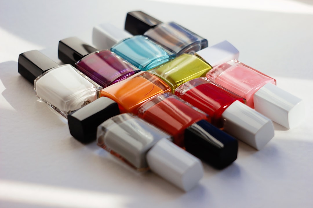
Color is one of the most powerful tools in a designer's arsenal. It can guide attention, evoke emotion, establish brand identity, and even influence decision-making. Understanding how color affects human psychology and behavior is essential for creating effective designs that resonate with users. In this article, we'll explore the psychological impact of colors in design and how to use color theory to create more compelling and effective visual experiences.
The Science Behind Color Psychology
Our relationship with color is complex and multifaceted. It involves physical, psychological, and cultural factors that all work together to shape our perception:
- Physical response: Colors can trigger physiological reactions. For example, red has been shown to increase heart rate and stimulate adrenaline.
- Psychological associations: We develop associations with colors based on our experiences and environments.
- Cultural context: Different cultures attach different meanings to colors. White, for instance, symbolizes purity in Western cultures but can represent mourning in some Eastern traditions.
These factors combine to create a complex relationship between humans and color that designers can leverage to create more impactful work.
The Emotional Impact of Primary Colors
Red: Passion, Urgency, and Energy
Red is a powerful, attention-grabbing color that evokes strong emotions. It can signify:
- Passion and love
- Urgency and importance
- Warning and danger
- Energy and excitement
In design, red is often used for call-to-action buttons, sale notifications, or error messages. It's effective for food-related businesses (as it can stimulate appetite) and brands that want to project boldness and confidence.
However, red should be used strategically and sparingly. Too much red can create feelings of aggression, induce stress, or overwhelm users.
Blue: Trust, Calm, and Reliability
Blue is one of the most universally favored colors and conveys:
- Trust and dependability
- Calmness and serenity
- Professionalism and expertise
- Security and stability
It's no coincidence that many financial institutions, healthcare providers, and technology companies incorporate blue into their branding. Blue helps establish credibility and reduces anxiety, making it ideal for situations where users need to feel secure.
Different shades of blue can evoke different emotions. Lighter blues feel refreshing and peaceful, while darker blues project more authority and intelligence.
Yellow: Optimism, Clarity, and Warning
Yellow is the most visible color to the human eye and can represent:
- Optimism and cheerfulness
- Clarity and logic
- Caution and warning
- Energy and warmth
In design, yellow can create a sense of happiness and warmth, but it must be used carefully. Bright yellows can cause eye fatigue when used in large amounts, while softer yellows can create a welcoming, accessible feeling.
Yellow is often employed to highlight important information, create energetic accents, or add a sense of playfulness to designs.
Secondary and Tertiary Colors in Design
Green: Growth, Health, and Balance
Green bridges the cool and warm color spectrums and signifies:
- Growth and renewal
- Health and wellness
- Environmental consciousness
- Wealth and abundance
In interface design, green often indicates success, approval, or completion. It can create a balanced, harmonious feeling and is particularly effective for brands related to health, sustainability, or financial prosperity.
Purple: Creativity, Luxury, and Spirituality
Historically associated with royalty due to the rarity of purple dyes, purple conveys:
- Creativity and imagination
- Luxury and quality
- Mystery and spirituality
- Wisdom and dignity
Purple can add a sense of premium quality or creative inspiration to designs. It works well for brands targeting creative audiences or positioning themselves as premium offerings.
Orange: Enthusiasm, Creativity, and Affordability
As a blend of red and yellow, orange inherits characteristics from both and represents:
- Enthusiasm and excitement
- Creativity and playfulness
- Affordability and accessibility
- Warmth and energy
Orange is often used for call-to-action elements that need to stand out without the urgency or aggression of red. It's popular in designs for products targeting younger demographics or brands wanting to appear friendly and approachable.
Neutral Colors and Their Role
Neutral colors—white, black, gray, beige, and brown—play crucial roles in design by providing balance and allowing other colors to shine.
White: Simplicity, Cleanliness, and Space
White creates a sense of:
- Cleanliness and purity
- Simplicity and minimalism
- Space and openness
- Neutrality and clarity
White space (or negative space) is essential in design for creating breathing room, improving readability, and allowing important elements to stand out.
Black: Sophistication, Power, and Elegance
Black communicates:
- Sophistication and elegance
- Power and authority
- Mystery and depth
- Timelessness and classic style
Black can add weight and importance to design elements. It's often used in luxury branding and for creating dramatic contrasts.
Gray: Balance, Neutrality, and Sophistication
Gray represents:
- Balance and neutrality
- Sophistication and maturity
- Practicality and timelessness
Gray works well as a background or for secondary elements, allowing more vibrant colors to stand out. Different shades of gray can convey different levels of authority and refinement.
Applying Color Psychology in Design Practice
Color Harmony and Contrast
Effective designs use color combinations that work well together while providing sufficient contrast for readability and hierarchy. Some key approaches include:
- Complementary colors: Colors opposite on the color wheel (like blue and orange) create vibrant contrasts.
- Analogous colors: Colors adjacent on the wheel (like blue, blue-green, and green) create harmonious, unified designs.
- Triadic colors: Three colors equally spaced on the wheel provide visual interest while maintaining balance.
- Monochromatic schemes: Various shades and tints of a single color create elegant, cohesive designs.
When planning color schemes, always ensure sufficient contrast between text and background colors for optimal readability—particularly important for accessibility concerns.
Cultural Considerations in Color Selection
While many color associations are relatively universal, some vary significantly across cultures:
- Red symbolizes luck and joy in Chinese culture but can represent danger or warning in Western contexts.
- White is associated with weddings and purity in Western traditions but with funerals and mourning in many Eastern cultures.
- Purple has royal associations in Western cultures but can symbolize mourning in some Latin American countries.
For designs with global reach, research cultural associations with your chosen colors and consider how they might be perceived by different audiences.
Practical Color Usage Guidelines
- Limit your palette: Most effective designs use 2-3 primary colors with additional neutrals. Too many colors can create visual chaos.
- Follow the 60-30-10 rule: Use your primary color for 60% of the design, a secondary color for 30%, and an accent color for 10%.
- Consider color accessibility: Approximately 8% of men and 0.5% of women experience some form of color blindness. Test your designs to ensure they work for users with color vision deficiencies.
- Create consistent color systems: Develop a clear system for how different colors function in your interface (e.g., blue for clickable elements, red for errors).
- Test color performance: A/B test different color options for important elements like call-to-action buttons to see which performs best with your specific audience.
Case Studies: Successful Color Usage in Design
Spotify: Energetic and Contemporary
Spotify's distinctive green creates a vibrant, energetic brand identity that stands out in the crowded music streaming market. The bright green against dark backgrounds provides strong contrast, while black adds sophistication and allows the interface content to shine.
Airbnb: Warm and Inviting
Airbnb's coral-pink color (officially named "Rausch") conveys warmth, friendliness, and passion—perfectly aligned with their mission of creating a sense of belonging. This distinctive color helps the brand stand out while evoking the welcoming feeling they want users to associate with their service.
Dropbox: Playful and Approachable
Dropbox uses a combination of blue (trust, reliability) with playful accent colors to balance the seriousness of cloud storage with an approachable, creative brand personality. Their color choices help make a technical service feel accessible and friendly.
Conclusion: The Strategic Value of Color
Color is never just decoration—it's a strategic tool that influences how users perceive, interact with, and remember your designs. By understanding color psychology and applying it thoughtfully, designers can create more effective, emotionally resonant experiences that connect with users on multiple levels.
When approaching color selection for your next project, start with the emotional response you want to evoke and the practical goals you need to achieve. Let these guide your palette choices, and always test your selections with real users to ensure they're creating the impact you intend.
Remember that the most effective use of color in design isn't about following trends or personal preferences—it's about strategic choices that enhance usability, reinforce brand identity, and create meaningful connections with your audience.